After three years of its foundation, Ton had already evolved beyond its original identity!
So, we made a major rebranding: positioning, visual identity, tone of voice, photography
and motion guidelines.
So, we made a major rebranding: positioning, visual identity, tone of voice, photography
and motion guidelines.
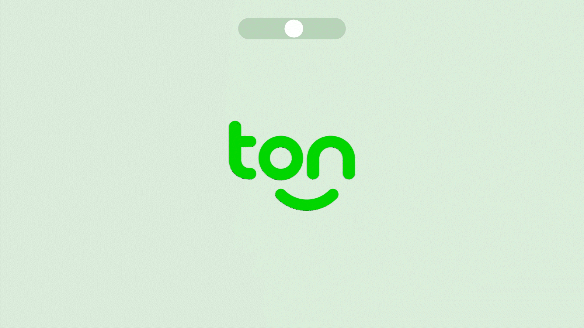
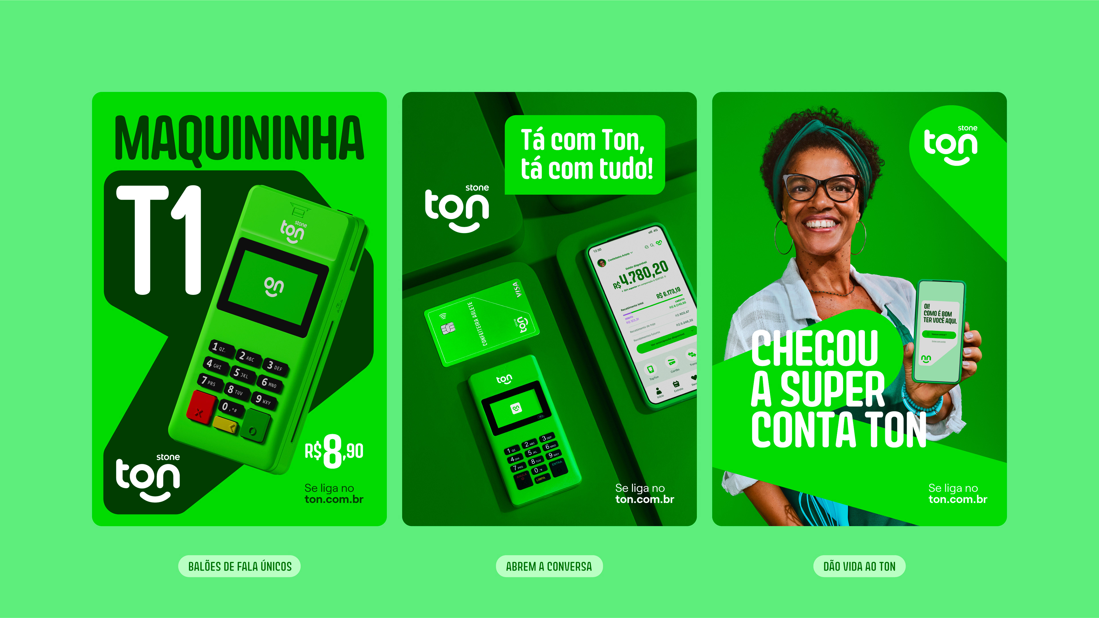
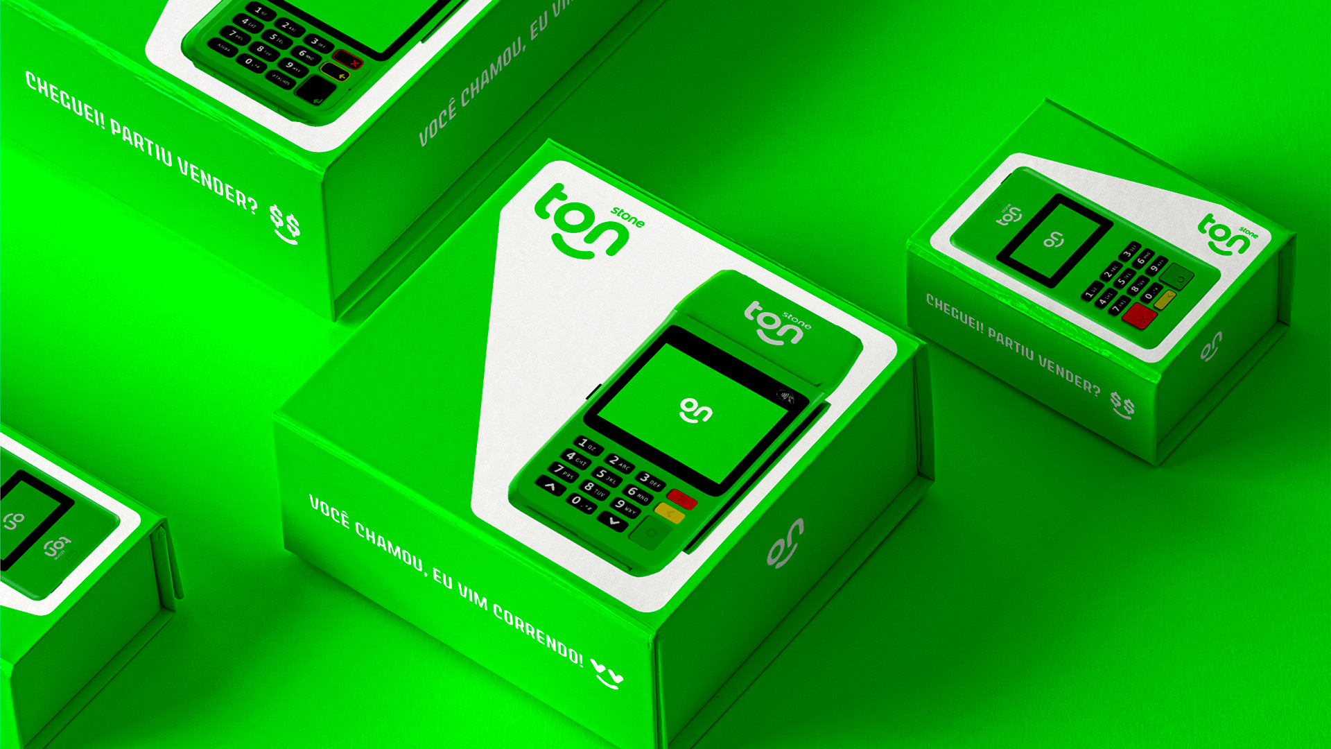
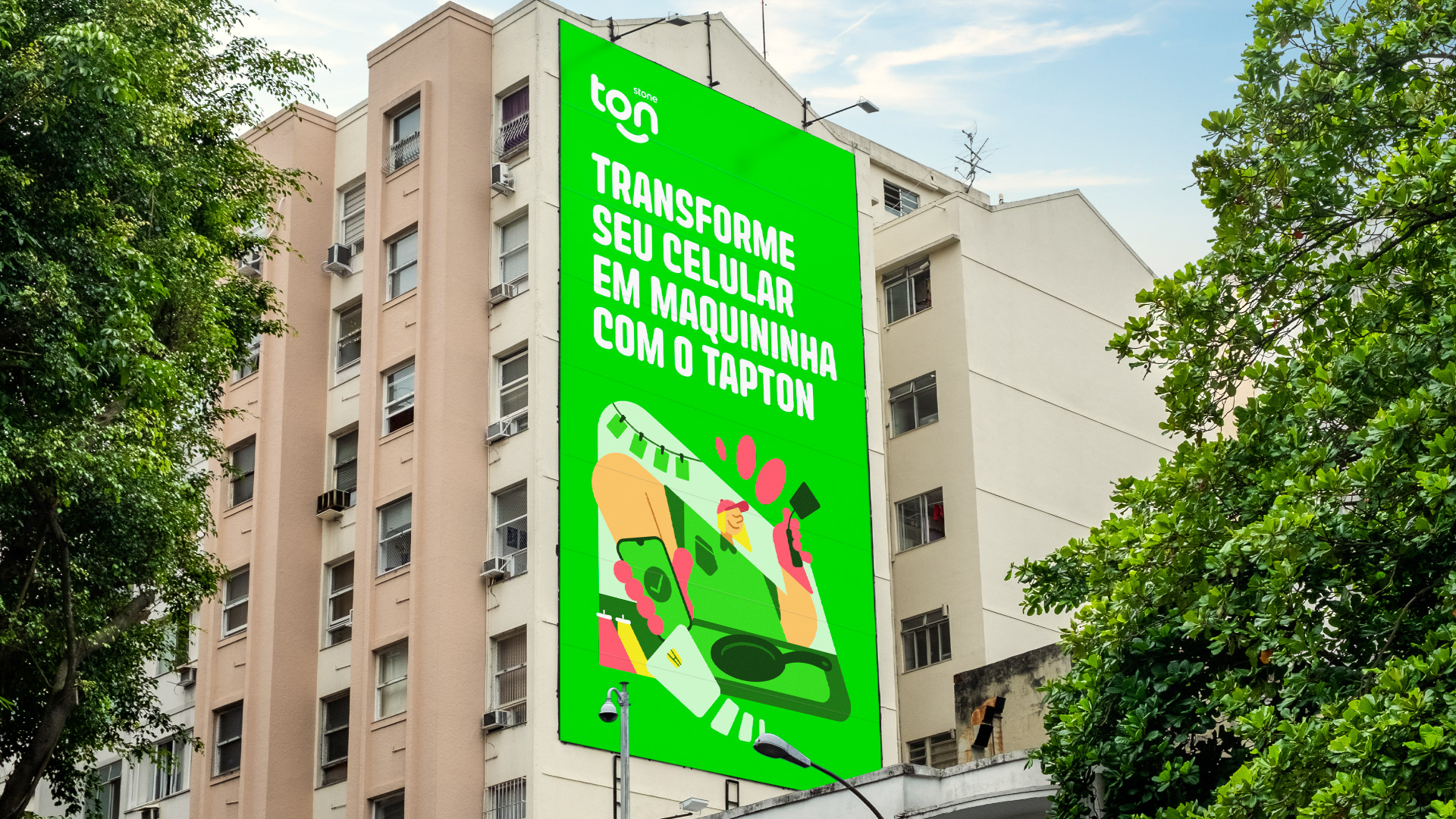
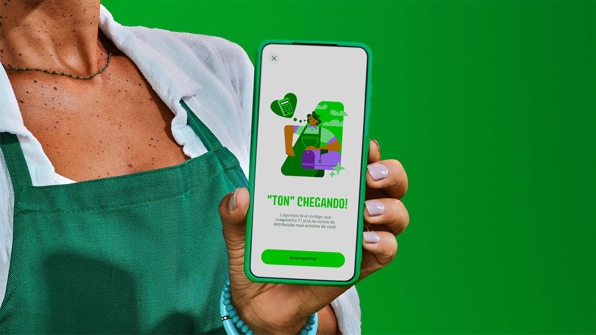
What used to be just a “little face” in the logo then became a living character, who expresses many moods and adapts to talk to the customer on an equal basis!
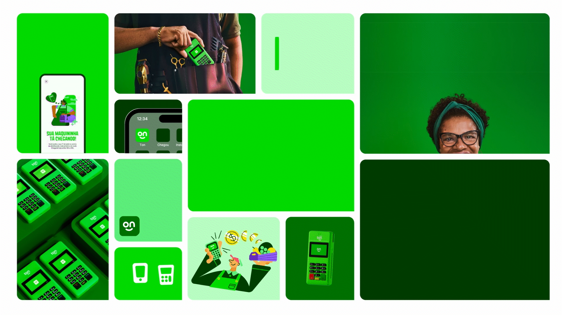
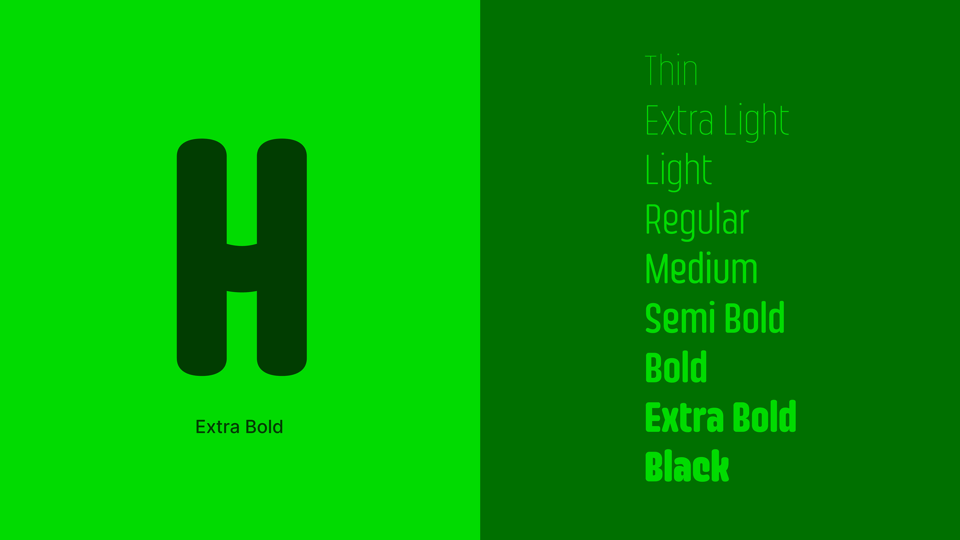
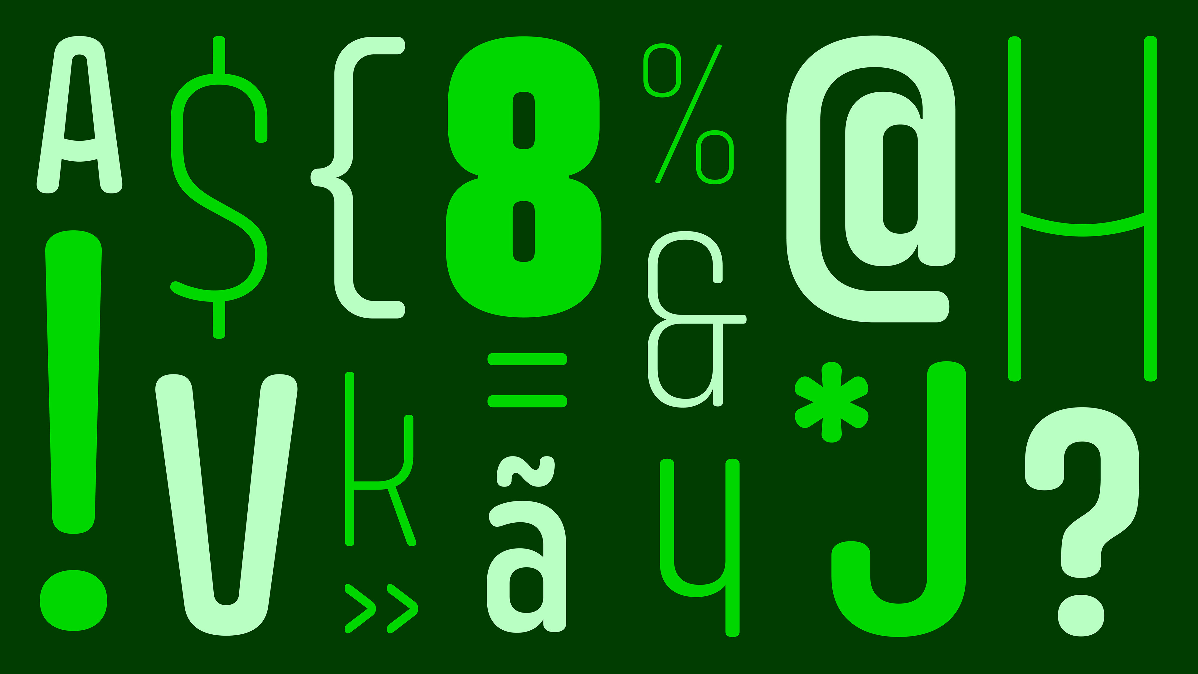
Ton Condensed is a custom Rounded typeface for titles. Inspired by the design of the logo,
it has rounded ends and “smiling” details (as you can see more clearly in the bars
of the letters A and H).
it has rounded ends and “smiling” details (as you can see more clearly in the bars
of the letters A and H).
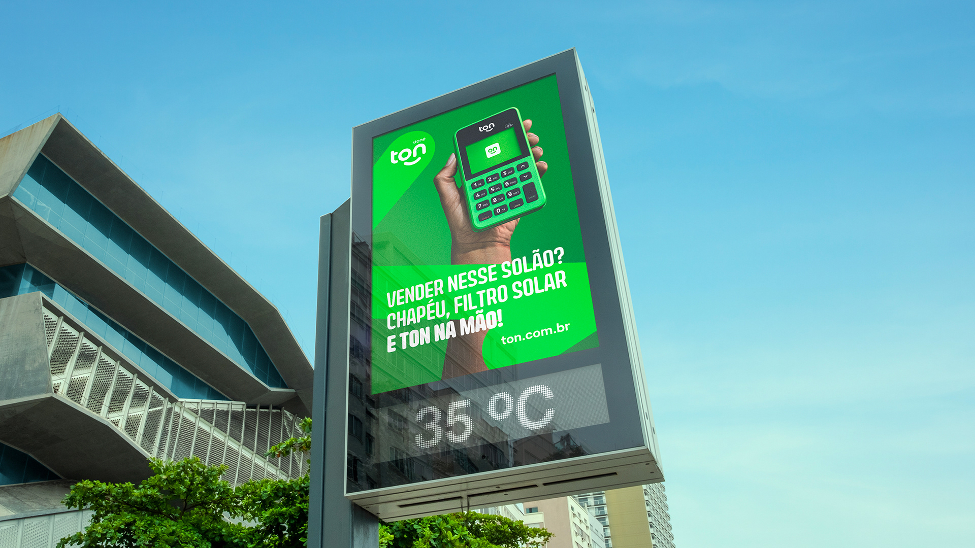
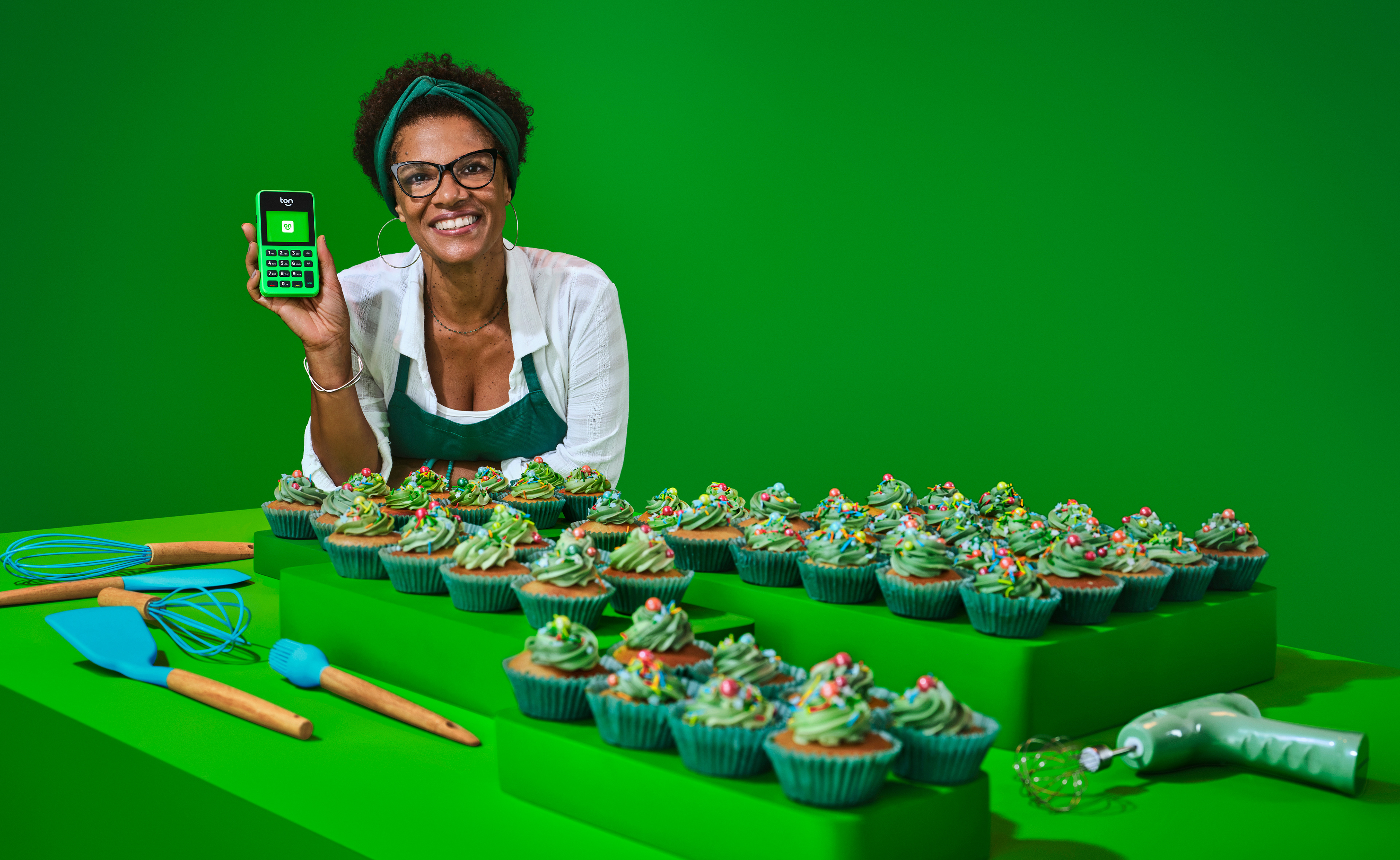
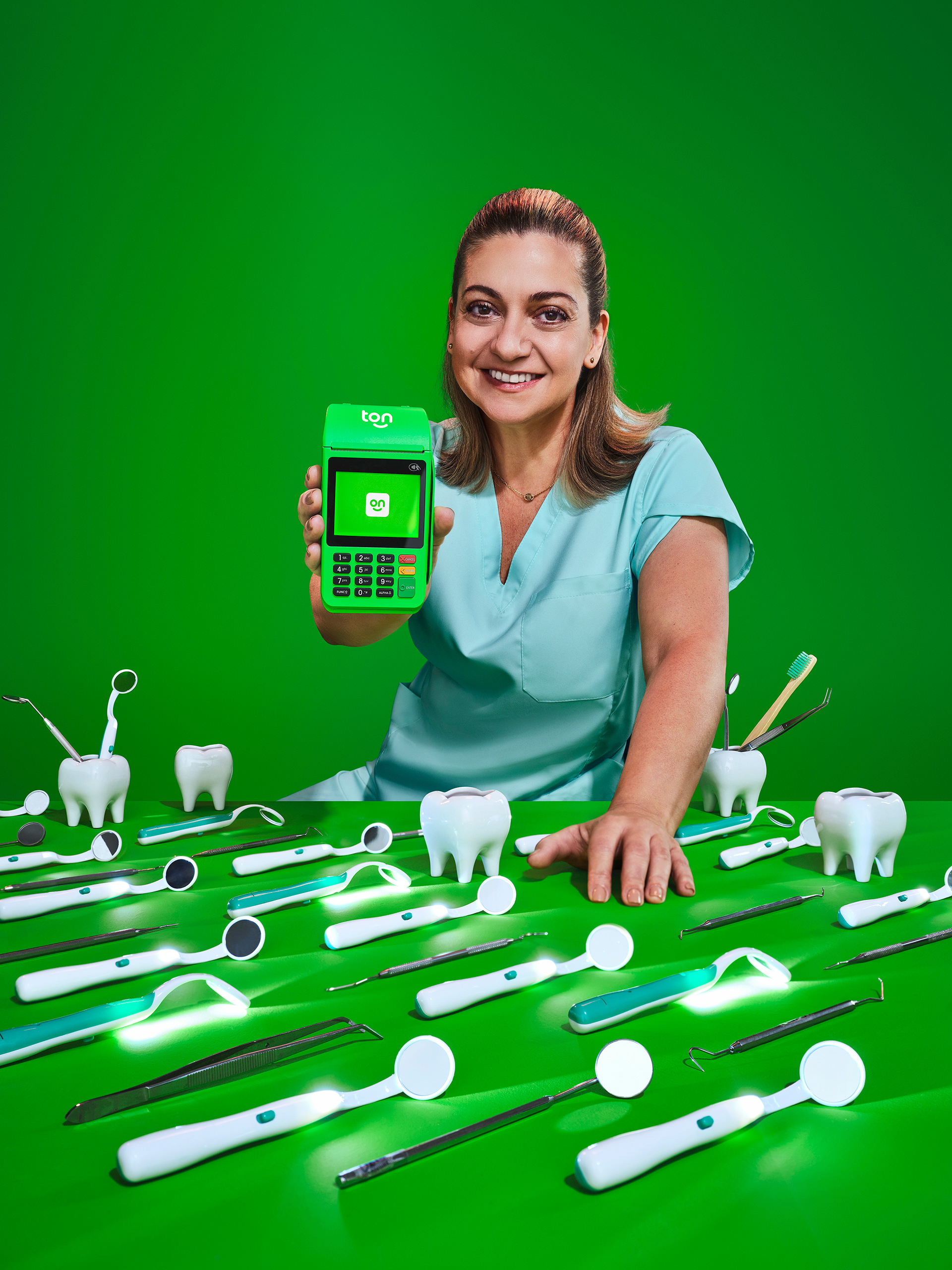
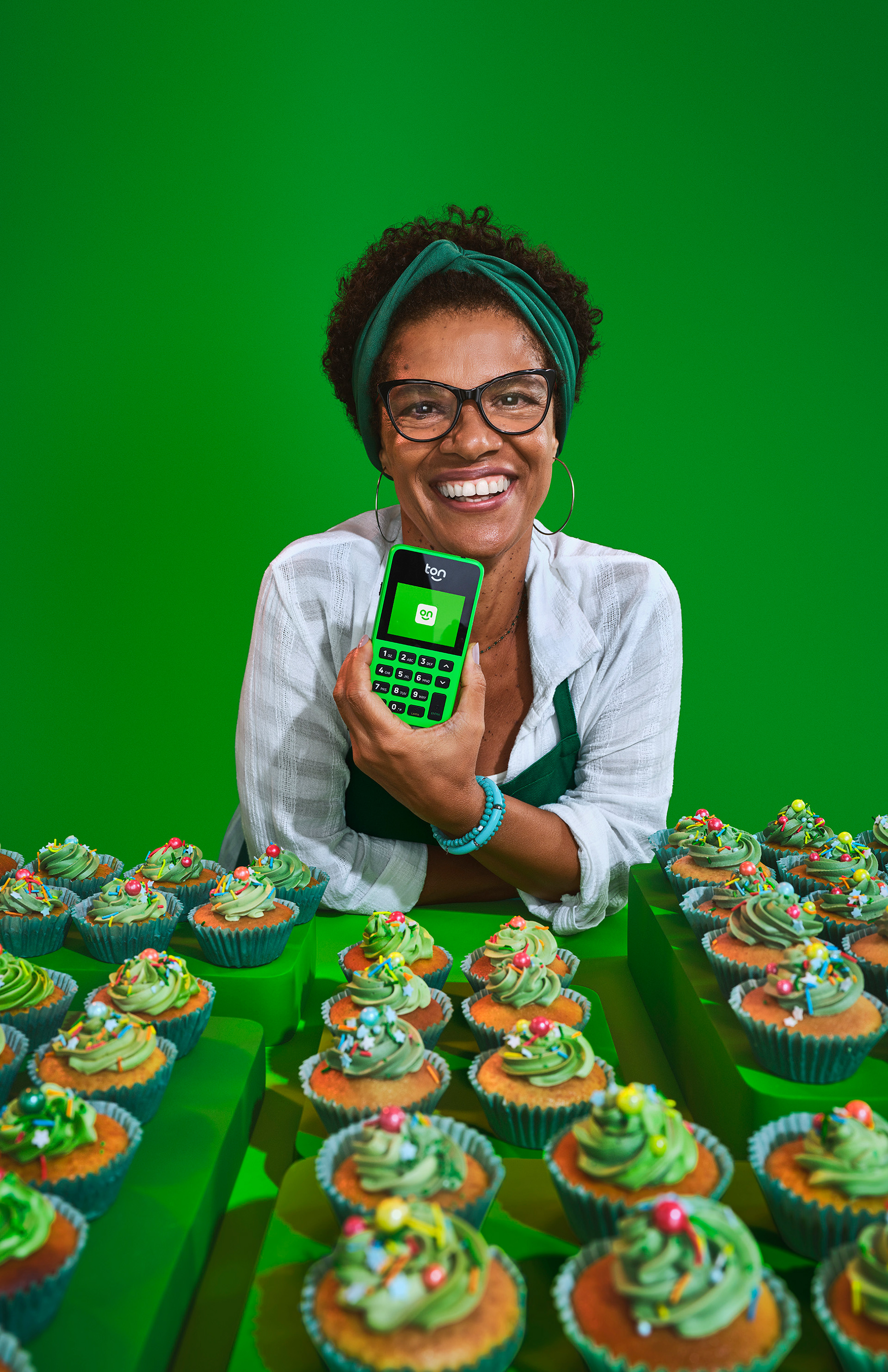
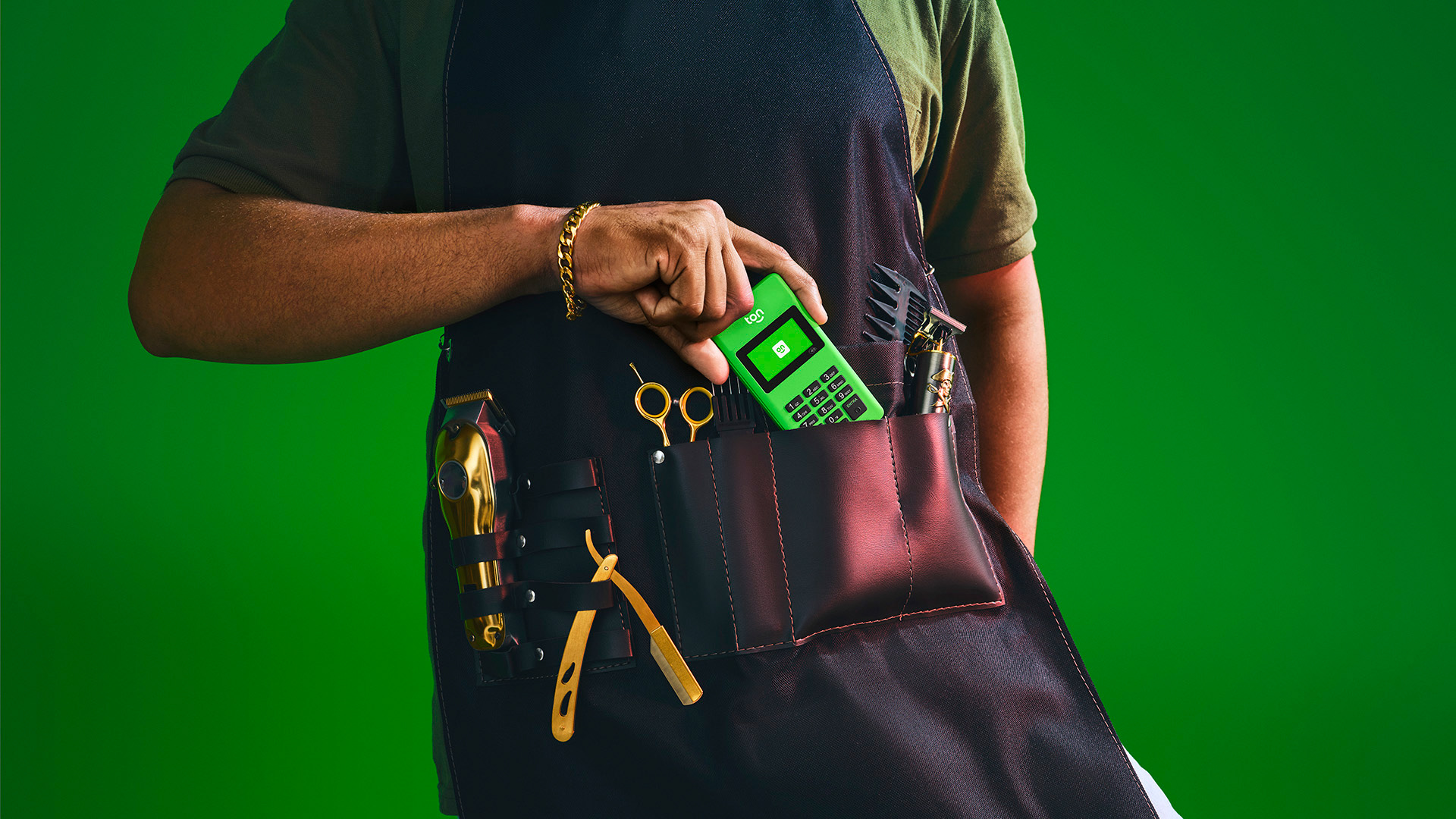
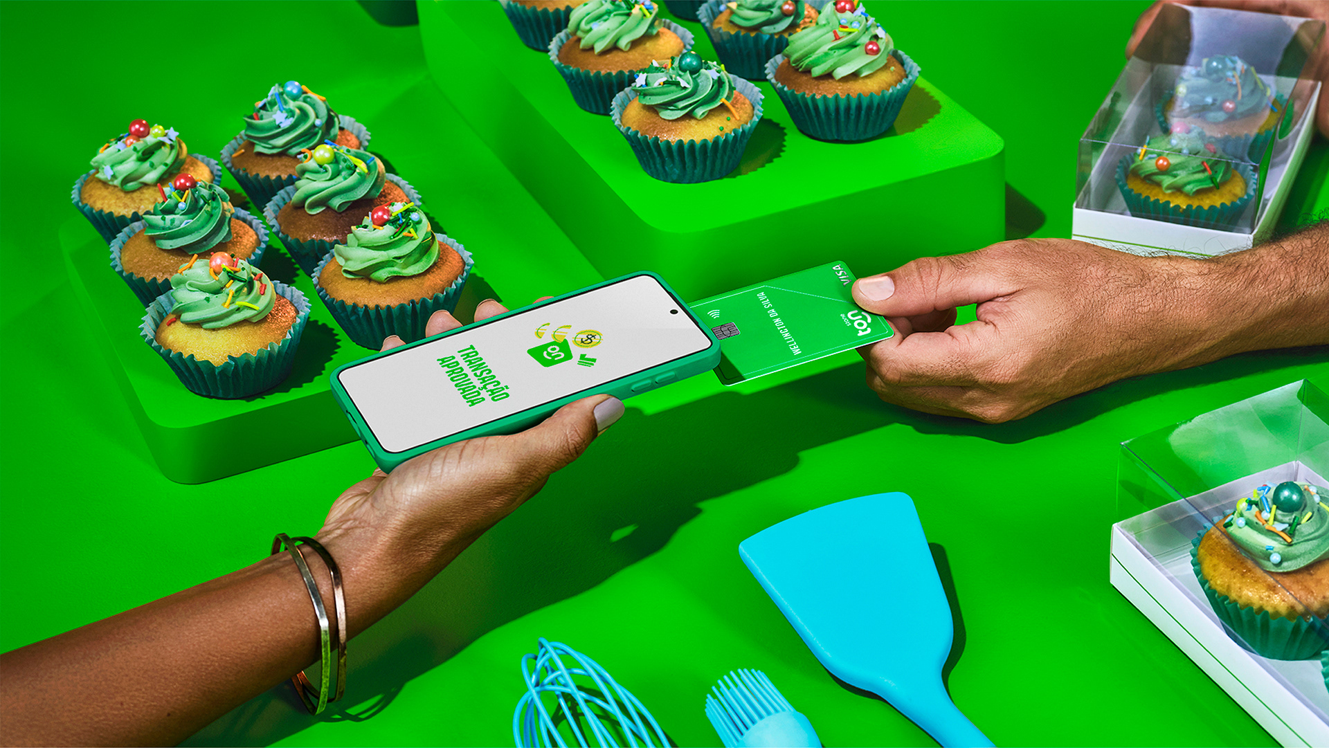
More than building a photographic style around real customers, the photographs make it possible to create communications focused on promoting the businesses driven by each micro-entrepreneur, whose names are also highlighted: the barber Joebe; the dentist Ana; and the baker Arlete (she made these delicious cupcakes!).
Stone Team
Design Lead: Alexandre Rizzuti
Design: Maiara Job, Marcelo Rodrigues
Motion: FutureBrand
Copy: Leonardo Rachid, Louis Vidovix
Photography: Gustavo Zylbersztajn
Typography: Thiago Bellotti
Illustration: Estúdio Barca
Awards: Brasil Design Award 2023 - Silver - Voice